Branding
EDALIMA
A branding project for a wellness and nutrition approach focused on balance, food education, and emotional well-being through a calm and organic visual identity.
Year :
2025
Industry :
Wellness
Client :
Daniela Palacios
Project Duration :
3 weeks
Problem :
Creating a wellness brand that could merge the concepts of nutrition and education into a calm and approachable visual identity, while also reflecting the client’s personal essence without turning the project into a traditional personal brand.

Solution :
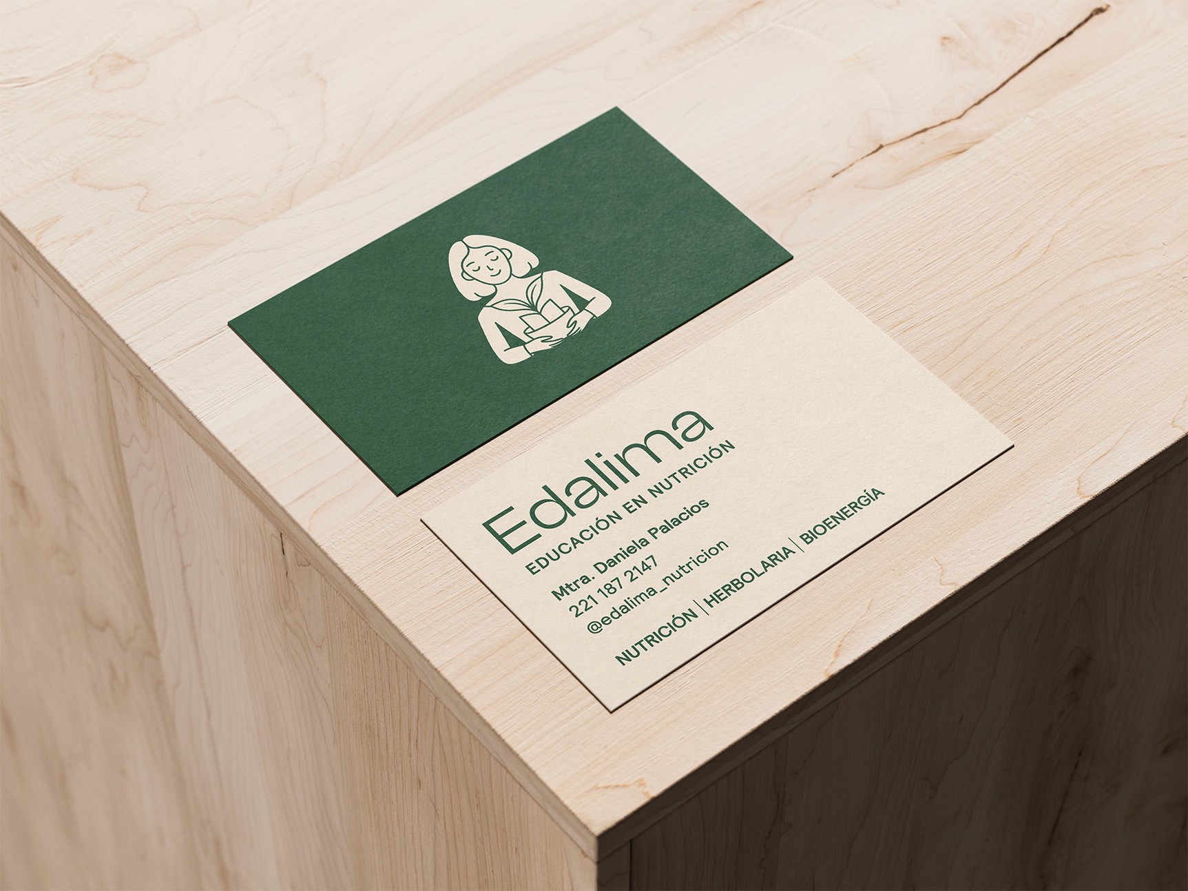
Building a brand that balanced education, wellness, and the client’s personality through a calm and organic design system. An icon was created by combining key elements that represent the brand’s values and approach, helping create a recognizable and meaningful symbol. Collage was also incorporated into the visual direction, inspired by the idea that learning is a process of experimenting, discovering, and putting pieces together, making collage a natural representation of growth and exploration. The name Edalima comes from three Spanish concepts that define the essence of the brand: educación (education), alimentación (feeding/nutrition), and alma (soul). Together, these ideas represent the brand’s holistic approach to wellness, combining learning, nourishment, and emotional connection into one identity.


Summary :
By combining wellness, education, and emotion into one visual system, Edalima created a distinctive presence that resonated with audiences looking for a more human and balanced approach to nutrition.
More Projects


New release
Preview
Branding
EDALIMA
A branding project for a wellness and nutrition approach focused on balance, food education, and emotional well-being through a calm and organic visual identity.
Year :
2025
Industry :
Wellness
Client :
Daniela Palacios
Project Duration :
3 weeks
Problem :
Creating a wellness brand that could merge the concepts of nutrition and education into a calm and approachable visual identity, while also reflecting the client’s personal essence without turning the project into a traditional personal brand.
Solution :
Building a brand that balanced education, wellness, and the client’s personality through a calm and organic design system. An icon was created by combining key elements that represent the brand’s values and approach, helping create a recognizable and meaningful symbol. Collage was also incorporated into the visual direction, inspired by the idea that learning is a process of experimenting, discovering, and putting pieces together, making collage a natural representation of growth and exploration. The name Edalima comes from three Spanish concepts that define the essence of the brand: educación (education), alimentación (feeding/nutrition), and alma (soul). Together, these ideas represent the brand’s holistic approach to wellness, combining learning, nourishment, and emotional connection into one identity.
Summary :
By combining wellness, education, and emotion into one visual system, Edalima created a distinctive presence that resonated with audiences looking for a more human and balanced approach to nutrition.
More Projects
New release
Preview